Polaris

UX / UI | User Research
Theme:
Surival game UI, retro-futuristic
Duration:
2024 (3 months)
A survival game UI mockup. In this PC based survival game, as you navigate the dangers of the wild, encounter patrolling robots, make tools and strive for survival, the closer you get, you slowly unravel the truth hidden beneath the city's pristine facade.


My Contribution
Created a survey, analyzed data, identified user issues, and communicated findings to the team.
Contributed to creating test methodology and conducted guerrilla usability testing.
Contributed to designing and developing the UI prototype using Figma, achieving about 70% interactivity in design elements.
Project Requirement
The professor gave us a prompt, "survival game UI," with some requirements of the mockup.
Game Objective
Remain alive until the end of the story.
Splash screen
A splash art that captures the post-apocalyptic element of the game. That make player feels engage to the story.
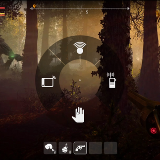
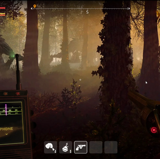
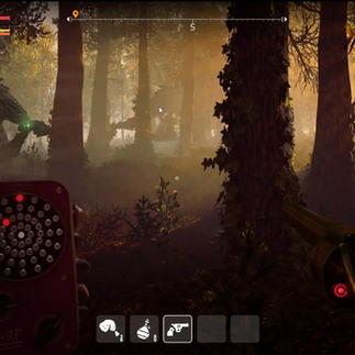
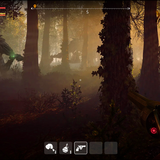
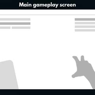
Gameplay
Game HUD interface that contains these elements:
Character information
Character needs
Item slot 10+
Direction
Minimap
Interactions
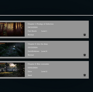
Game Result screen
Daily summary along with player progression toward the ending of the game.
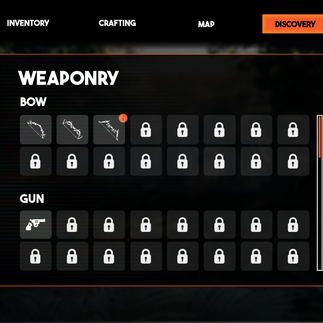
Character profile / Personal profile
Player character profile that allows players to customize their character appearance and loadout (weapon, equipment, and accessory). Along with showing character stats.
Option screen
The option screen that contains most of the important elements, like other game (Control/Graphic/Sound/Account/Language)
High Concept
After a huge war, a group of humans decides to build the perfect utopia named “The Polaris.” Everything must be 100%, from the roads to the valleys, even the people. “Products” with defects are tossed aside to rot and burn, making space for those with a higher quality.
You play as one of the imperfect kids separated from your family and being escorted outside the city. But when the truck transporting you crashes, you find yourself free, blind from the truth, and you want to go home, back to your family.
Lost in the wilderness, surrounded by the remnants of a forgotten past, your goal is clear...
Find your way back to The Polaris
Target Audience Research

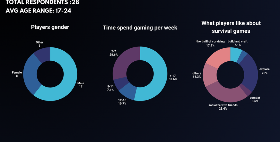


The result shows that our target audiences are mostly male, age 17-24, spending more than 17 hours on gaming per week. With the top 3 reasons for what they like about survival games being...
Socializing and spending time with their friends.
Exploring the game environment.
The thrill and immersion of surviving.
Their top 4 past experiences in survival games include Minecraft, ARK: Survival Evolved, Subnautica, and The Forest.
Personas
Now that we got some data of our target audiences to work with, we created personas for our game.


Mood board
Then I contributed to creating the mood board to make sure the artists are on the same page about what our game is supposed to look and feel like. While working on it, I did think about using black as the main color contrasting with a reddish color since it's a very common approach to this post-apocalypse genre.
However, our artists think the idea is a bit too generic and decided to take on some challenges by using dark teal and bright orange to make the color more interesting while keeping the same level of darkness.

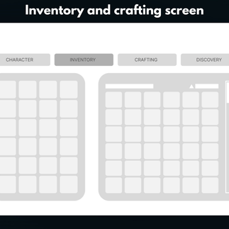
How the inventory should look like?
A team member did suggest going for a diegetic UI for the inventory like Green Hell or Sons of the Forest. While these kinds of UI are very good for immersion, they can be hard to navigate or get used to for some players.


So to settle the matter, I conduct a survey gathering insights from our target audiences. According to the survey, about 40% find Green Hell's inventory hard to navigate, and about 20% find Sons of the Forest's inventory overwhelming.
To my surprise, Subnautica's inventory was rated the highest, with 93% of the target audience saying it's simple to navigate. While it might not be the most immersive, it shows that our target audiences are the most comfortable with grid-based inventory.

What about the HUD?
I also created a survey showing multiple player status HUDs, including Sons of the Forest, ARK: Survival Evolved, Green Hell, Fallout 4, Rust, and Subnautica, asking the target audiences to rate them based on how easy they are to use and navigate.
The number of people who voted these game HUD as the best


Based on the survey result, Rust was picked as the best out of 7 choices with 28% of the vote. Subnautica followed in second place with 17%, while ARK: Survival Evolved, Fallout 4, and Green Hell all tied for third at 14%.
While all mentioned game HUDs are usable, Polaris falls closer to a high-stress game with less complex player status similar to Rust, so it's crucial for the players to be able to glance at their health and status in a quick moment without the HUD obstructing their view of enemies or resources.
Plus, more than half of our primary personas voted for Rust as the best HUD, so we can assume that our target audience prioritizes unobtrusive design and simplicity.
Low-Fidelity Wireframe
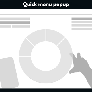
Once we got all the data, we then started developing the low-fidelity wireframe with the desire to immerse the player into survival thrill experiences, so the main gadgets, such as the radio and map, are all diegetic and accessible through a quick menu popup instead of putting all of them in the quick inventory HUD. The status display HUD was kept minimal at the top left of the screen.


High-Fidelity
Once we were satisfied with how the layout was, we moved on toward the high fidelity. Focusing on putting the theme and mood from our mood board into the prototype.